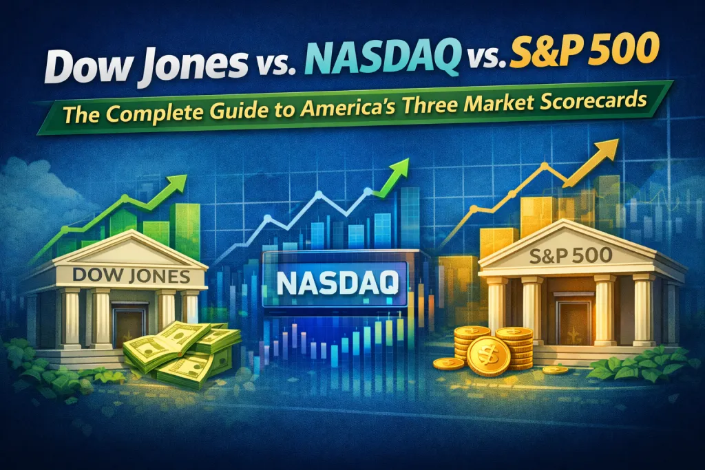
Dow Jones vs. NASDAQ vs. S&P 500: The Complete Guide to America's Three Market Scorecards
Every day, millions of people around the world wake up and check three numbers. They appear on Bloomberg terminals, in WhatsApp forwards, at the bottom of news tickers, and in the first line of every financial market report. The Dow Jones Industrial Average. The S&P 500. The NASDAQ Composite.
Most people know these names the way they know the names of currencies — vaguely familiar, intuitively important, but not fully understood. They know that when these numbers go up, things are generally good, and when they crash, people panic. But beyond that, the differences blur.
This article is an attempt to fix that. Not just the surface-level "Dow has 30 stocks, S&P has 500" explanation that you can get from any search result, but the real story — the history, the methodology, the philosophy behind each index, their quirks, their blind spots, and crucially, what each one is actually telling you when it moves.
First, a Clarification That Almost Nobody Makes
Here's something that creates genuine confusion even among people who follow markets regularly: these three things are not stock exchanges. They are indices — measurements.
The New York Stock Exchange (NYSE) and the NASDAQ Stock Market are the actual exchanges where stocks are bought and sold. An index, by contrast, is a calculated number that tracks the performance of a selected basket of stocks. Think of it like a thermometer. The thermometer doesn't create the heat. It just measures it.
The Dow, the S&P 500, and the NASDAQ are thermometers — each measuring a different part of the market, using a different thermometer design, pointed at a different room.
With that cleared up, let's go chronologically.
Part One: The Dow Jones Industrial Average
The Origin Story
It is May 26, 1896. Charles Henry Dow — journalist, co-founder of Dow Jones & Company, and the man who would also go on to found The Wall Street Journal — sits down and does something that seems almost laughably simple in retrospect. He adds together the stock prices of 12 companies and divides by 12. The result: 40.94.
That number — that average of 12 stock prices on a single May afternoon in the late 19th century — is the direct ancestor of the Dow Jones Industrial Average you check on your phone today.
Dow Jones & Company was formed in 1882 by Charles H. Dow and Edward Jones. The first index Dow created, in 1884, was actually a railroad index — 11 stocks, mainly rail companies, published in a daily financial news bulletin called the Customer's Afternoon Letter, which was the precursor to The Wall Street Journal. Railroads were the technology sector of the 1880s — the fastest-growing, most capital-intensive, economy-shaping industry of the era.
By 1896, Dow decided to create a separate industrial average — one that tracked manufacturing and production companies rather than railroads. He calculated his first average purely of industrial stocks on May 26, 1896, creating what is now known as the Dow Jones Industrial Average. When it was first published, the index stood at a level of 40.94.
The original 12 companies reflected the dominant sectors of the era: cotton, sugar, tobacco, gas, and railroads. The index expanded to 20 stocks in 1916 and reached its current 30-component format in 1928.
What It Actually Measures
Today, the Dow tracks 30 companies. Just 30. They are chosen by a committee — three representatives from S&P Dow Jones Indices and two from The Wall Street Journal — and companies are added only if they're deemed to have an excellent reputation, a history of sustained growth, and interest from a large number of investors.
The current roster reads like a who 's-who of blue-chip America: Apple, Microsoft, Goldman Sachs, JPMorgan Chase, Johnson & Johnson, Coca-Cola, Nike, Walmart, Home Depot, Boeing, Caterpillar, and others. These are not speculative bets. These are companies that have been dominant for decades, often for generations.
The Dirty Secret: It Is Price-Weighted
Here is the most important — and most misunderstood — thing about the Dow. It is a price-weighted index. That means a stock's influence on the Dow is determined entirely by its share price, not by the actual size of the company.
Let's pause on this because it's genuinely strange once you think about it.
The primary pitfall of this approach is that a stock's price — not the size of the company — determines its relative importance in the index. For example, as of March 2025, Goldman Sachs represented the largest component of the index with a market capitalization of approximately $167 billion. In contrast, Apple's market capitalization was approximately $3.3 trillion at the time, but it fell outside the top 10 components because its share price was lower relative to Goldman's.
Read that again. Apple, the most valuable company in human history for a sustained period, was less influential in the Dow than Goldman Sachs, simply because Goldman's stock price per share happened to be higher. Market capitalization — the actual measure of how big a company is — doesn't enter the calculation at all.
This is not a minor technical footnote. It is a fundamental flaw in the Dow's design, one that exists purely because the index was created in 1896, when computing was done by hand and adding share prices was as sophisticated as the math could reasonably get.
Initially, the Dow Jones Industrial Average was calculated by simply adding up the stock prices of the twelve companies and dividing by twelve. Over time, as companies did stock splits and other corporate actions, the divisor was adjusted. Today, the Dow uses what's called the "Dow Divisor," a proprietary number that has been continuously adjusted to account for splits, spin-offs, and component changes while keeping the index mathematically consistent across time.
What the Dow Tells You
Despite its structural quirks, the Dow remains useful as a sentiment gauge for large, established American businesses. When you see the Dow moving, you are broadly seeing how the biggest, most household-name companies in America are performing.
Because of its focus on high-quality, dividend-paying firms, the Dow has tended to hold up better than the other indexes in down markets. In 2022, for instance, the Dow lost only 7% compared with a nearly 19% loss in the S&P and a 32% slide in the NASDAQ.
It also carries one particular quirk that makes it beloved by financial media: when you hear about the Dow, some references may be intended to make the movement of the day seem more dramatic. Consider which of these headlines is bound to get more attention: "The Dow fell 390 points today," or "The S&P 500 was down 50 points today." In both cases, the decline is roughly 1 percent. The Dow's higher absolute point value makes the same percentage move sound more dramatic — which is why it dominates news coverage even though it is, by most professional assessments, the least representative of the three indices.
Also Read: https://www.investwhat.in/india/investment/equities/26855/why-valuation-matters-more-than-growth
Part Two: The S&P 500 — The Benchmark

The Origin Story
If the Dow is the grandfather, the S&P 500 is the standard by which everything in American investing gets measured. It is the index that professional fund managers are evaluated against, that pension funds use as their reference, that Warren Buffett recommends to ordinary investors, and that represents, as a single number, the health of corporate America more faithfully than anything else.
The S&P 500 originated with the collective efforts of Standard Statistics Company and Poor's Publishing. In 1923, Standard Statistics Company began rating mortgage bonds and developed its first stock market index consisting of the stocks of 233 U.S. companies, computed weekly. In 1941, Poor's Publishing merged with Standard Statistics Company to form Standard & Poor's. On Monday, March 4, 1957, the index was expanded to its current extent of 500 companies and was renamed the S&P 500 Stock Composite Index.
The timing of the S&P 500's creation is significant. Standard & Poor's was explicitly trying to build something better than the Dow. In response to the flawed price-weighting methodology of the Dow, Standard & Poor's was seeking a way to track the market in aggregate, to generate a view of the investment experience of investors as a collective, and the index it invented was rightly capitalization weighted.
The New York Times, in its March 5, 1957 issue, wrote: "Starting today, The New York Times is publishing the new Standard & Poor's Corporation index of 500 common stock issues. It represents the prices of shares comprising more than 90 per cent of the value of the New York Stock Exchange common stock issues held by investors. This new gauge of the market is made possible by the marriage of a stock market ticker with an electronic computer."
How It Works: Market Capitalization Weighting
The S&P 500 uses market-capitalization weighting, which is far more intuitive than price weighting. Your weight in the index is proportional to your size. A company worth $3 trillion has far more influence than a company worth $30 billion, because that accurately reflects economic reality.
The formula is elegant: each company's weight equals its float-adjusted market cap divided by the total float-adjusted market cap of all 500 companies in the index. "Float-adjusted" means the calculation only counts shares that are actually available to the public for trading — shares held by insiders, governments, or controlling shareholders are excluded.
If company A has a $200 billion market cap and company B has a $100 billion market cap, the total is $300 billion. Consequently, company A's weight is about 66.67% and company B's is 33.33%, meaning company A's performance has roughly twice the impact on the index.
The Entry Criteria
Getting into the S&P 500 is not automatic. A committee reviews eligibility, and companies must meet strict criteria. Market capitalization must be greater than or equal to $22.7 billion (effective July 1, 2025). The company must have its primary listing on a U.S. exchange. Annual dollar value traded to float-adjusted market capitalization must be greater than 0.75. The company must have a minimum monthly trading volume of 250,000 shares in each of the six months leading up to the evaluation date.
There's also a profitability requirement: the most recent quarter's earnings must be positive, and the sum of the most recent four quarters' earnings must also be positive. This is why some large, well-known loss-making companies — a Tesla in its early years, for instance — couldn't enter the index until they demonstrated sustained profitability.
Why Professional Investors Live and Die by the S&P 500
The S&P 500 is one of the most commonly followed equity indices and includes approximately 80% of the total market capitalization of U.S. public companies, with an aggregate market cap of more than $61.1 trillion as of December 31, 2025.
That 80% figure is crucial. When you own an S&P 500 index fund, you effectively own a meaningful slice of almost every economically significant public company in America. You own banks and tech companies and healthcare firms and consumer brands and industrial giants — all in one instrument.
The average annualized return of the S&P 500 since its inception in 1957 is approximately 10; that number has become the baseline against which virtually every investment strategy on earth is judged. If your hedge fund or your active stock-picking or your alternative asset strategy can't beat 10% annually over the long run, the market is telling you something uncomfortable.
As of January 2026, the 10 largest components are, in order: Nvidia (7.17%), Alphabet (6.39%), Apple (5.86%), Microsoft (5.33%), Amazon (3.98%), Broadcom (2.51%), Meta Platforms (2.49%), Tesla (2.31%), Berkshire Hathaway (1.68%), and Eli Lilly (1.55%). The ten largest companies account for approximately 38% of the market capitalization of the index.
This concentration at the top — a handful of mega-cap technology companies commanding more than a third of the index's weight — is something critics point to as a risk. The S&P 500 is often described as a diversified index, and it is, across 500 companies and 11 sectors. But when the top 10 holdings account for 38% of the weight, "diversified" needs an asterisk.
Part Three: The NASDAQ
The Origin Story
The NASDAQ's origin story is unlike anything in the history of financial markets. It was not created to track stocks. It was created to revolutionize how stocks were traded.
By the late 1960s, the over-the-counter (OTC) securities market in the United States was a mess. Securities not listed on major exchanges like the NYSE were traded over the phone — dealer to dealer, with no standardized pricing, no transparency, and enormous inefficiency. Prices varied from dealer to dealer. Investors had no way to verify they were getting a fair price.
The NASDAQ's mission was specific: to automate the opaque and often fragmented market for over-the-counter securities, most of which were not listed on any of the major U.S. stock exchanges.
On February 8, 1971, the NASDAQ Stock Market commenced operations as the world's first fully electronic stock market. Initially, NASDAQ served as a "quotation system" rather than a platform for electronic trading. Intel Corporation was one of the first major corporations to list its shares on NASDAQ.
The acronym itself tells the story: National Association of Securities Dealers Automated Quotations. NASDAQ was automated, built at a time when automation was radical.
Apple had its IPO on NASDAQ in 1980, and Microsoft listed on NASDAQ in 1986. These two listings — which might seem like corporate housekeeping decisions in retrospect — permanently shaped what NASDAQ would stand for: a home for technology, growth, and disruption. Every major technology IPO since has been a NASDAQ story.
The Index vs. The Exchange
This is a critical distinction. NASDAQ refers to two separate things, and conflating them causes endless confusion:
NASDAQ, the Exchange, is the actual marketplace — the electronic system where stocks are bought and sold. It lists over 3,000 companies.
The NASDAQ Composite (ticker: IXIC) is an index that tracks essentially all the stocks listed on the NASDAQ exchange. It currently includes more than 3,000 stocks, heavily weighted toward technology and communications.
The NASDAQ 100 (ticker: NDX) is a subset of the 100 largest non-financial companies listed on NASDAQ. This is the index that most NASDAQ-tracking ETFs like QQQ actually follow. When someone says "the NASDAQ is up 2%," they usually mean the Composite, but when a fund manager says they're benchmarked to NASDAQ, they almost always mean the 100.
Both the NASDAQ Composite and the NASDAQ 100 use market-cap weighting, the same as the S&P 500.
The Tech Concentration Problem (and Feature)
The more than 2,500 stocks in the NASDAQ Composite index skew heavily toward stocks in the technology and communications sectors, which make up 48% and 14% of the index, respectively. Apple and Microsoft alone account for a quarter of the index.
This concentration is not a bug that crept in accidentally. It is the index's fundamental character. NASDAQ is where growth companies go to list, and technology is the defining growth sector of the modern era. The result is an index that is simultaneously the most exciting and the most volatile of the three.
When the dotcom bubble popped, and the market slumped from 2000 to 2002, the NASDAQ shed 78% compared with a 49% drop in the S&P 500 and a 34% downdraft in the Dow. That is not a typo. The NASDAQ lost nearly four-fifths of its value. Companies with no revenue, no path to profitability, and names ending in ".com" had been priced as if the laws of financial gravity didn't apply to them. When gravity reasserted itself, it was catastrophic.
And yet, in a comparative study between the NASDAQ 100 and the S&P 500, the NASDAQ 100 outperformed the S&P 500 every year from 2007 to 2025, posting a total average return of +17.1% compared to the S&P 500 return of +12.2%. A notable exception is 2022, when the NASDAQ 100 underperformed relative to the S&P 500 by -14.3%.
This is the NASDAQ's paradox, and it's worth sitting with. The index that lost 78% of its value in two years is also the index that has, over a sustained 18-year period, generated significantly better returns than the broader market. The price of higher returns is higher volatility — and in NASDAQ's case, that price is steep.
The Three Side by Side: A Clear Comparison
Let's put the key differences in plain language.
How many stocks? The Dow has 30. The S&P 500 has approximately 500. The NASDAQ Composite has over 3,000. More stocks generally means more diversification and a better picture of the broader market.
How are stocks weighted? The Dow is price-weighted — a company's stock price per share determines its influence, which is arbitrary and somewhat absurd. The S&P 500 and NASDAQ are both market-cap weighted — a company's total market value determines its influence, which is rational and reflects economic reality.
What sectors dominate? The Dow is the most balanced across sectors — financials, healthcare, industrials, consumer brands, and technology all have representation. The S&P 500 is broad but increasingly technology-heavy at the top. The NASDAQ is explicitly technology-and-growth-first.
How volatile? The Dow is the least volatile of the three, because it is anchored in established blue-chip companies with long track records and dividend histories. The S&P 500 is moderately volatile. The NASDAQ is the most volatile, by a significant margin.
Who uses them? Retail investors and financial media favor the Dow for its familiarity. Professional fund managers and institutional investors use the S&P 500 as their primary benchmark. Technology investors, growth investors, and venture-adjacent investors track the NASDAQ.
How are components selected? The Dow and S&P 500 both use committees with qualitative judgment alongside quantitative criteria. The NASDAQ Composite is essentially rule-based: if you're listed on the NASDAQ exchange, you're in.
The Weighting Problem: An Underappreciated Risk
There is a structural issue in the S&P 500 and NASDAQ that deserves its own section, because it's quietly changing the nature of these indices in ways that most investors don't fully appreciate.
Both indices are market-cap weighted. This sounds sensible — bigger companies have more influence. But here's the issue: when a market-cap weighted index rises, the companies that go up the most automatically become a larger percentage of the index. If Apple goes from being 5% of the S&P 500 to 8%, investors tracking the index automatically have more Apple exposure — without making any active decision.
This creates a self-reinforcing feedback loop. Money flows into index funds → index funds must buy more of the biggest companies → the biggest companies get bigger → they become an even larger share of the index → index funds must buy even more of them. The result is that passive investing, which was supposed to be a neutral, market-reflecting strategy, has gradually become a momentum-amplifying force.
The ten largest companies in the S&P 500 account for approximately 38% of the market capitalization of the index, and the 50 largest components account for 60% of the index. In other words, the bottom 450 companies in the S&P 500 — the other 90% by count — collectively account for just 40% of the index. This is not what most people picture when they think "diversified index fund."
For the NASDAQ, the concentration is even more extreme. Apple and Microsoft alone are roughly a quarter of the Composite. A bad year for two companies can define the NASDAQ's entire performance.
This doesn't mean index funds are bad investments — the evidence for their superiority over active management over long time periods remains strong. But it does mean that investors who think they're broadly diversified when they own an S&P 500 or NASDAQ index fund are somewhat more concentrated in a handful of mega-cap technology companies than they may realize.
The Interest Rate Dimension
Understanding how these indices behave relative to interest rates is essential — especially after the rate environment of 2022-23 provided one of the sharpest natural experiments in recent market history.
When interest rates rise, the present value of future cash flows falls. This is basic DCF math. The further out in the future those cash flows are, the more their present value gets crushed by higher discount rates.
This is why the NASDAQ — which is dominated by growth companies whose value is largely derived from cash flows projected 5, 10, and 15 years into the future — is dramatically more sensitive to interest rate changes than the Dow. Blue-chip companies in the Dow are generating cash flows today. They're paying dividends today. Higher rates hurt them somewhat, but the damage is contained.
Growth companies, by contrast, are essentially long-duration bonds — their value is almost entirely future-dated. When rates rose sharply in 2022, the NASDAQ fell 32% while the Dow fell only 7%. This was not primarily because NASDAQ companies' businesses deteriorated badly. It was because the mathematics of valuation — the discount rate applied to their future cash flows — shifted dramatically.
This relationship is important to understand as a framework, not just a one-time observation. In any rising rate environment, expect growth-heavy, long-duration indices (NASDAQ) to be hit harder than value-heavy, short-duration indices (Dow). In falling rate environments, expect the reverse.
Historical Performance: The Story in Numbers
Rather than cherry-pick periods, here is the honest picture across different market cycles:
The Dotcom Boom (1995–2000): NASDAQ dramatically outperforms as technology companies reach stratospheric valuations. The S&P 500 also does well, riding the tech wave. The Dow lags, being less exposed to the technology frenzy.
The Dotcom Bust (2000–2002): NASDAQ collapses 78%. S&P 500 falls 49%. Dow falls 34%. The more conservatively structured index holds up the best.
The Recovery and Pre-Crisis Bull Market (2003–2007): All three recover, with the S&P 500 and NASDAQ broadly performing similarly. The Dow, being more concentrated in financials and industrials, also recovers well.
The Financial Crisis (2008–2009): All three declined sharply. Financials — heavily represented in the Dow — are crushed. The S&P 500 falls about 57% peak to trough.
The Post-Crisis Bull Market (2009–2019): NASDAQ begins a historic outperformance driven by the rise of Apple, Amazon, Google, Facebook, and other technology giants. The S&P 500 performs excellently as well. The Dow, less tech-exposed, underperforms in relative terms.
The Pandemic Crash and Recovery (2020): All three fell sharply in March 2020. The NASDAQ recovers fastest and most dramatically, as the pandemic accelerated digital adoption. The Dow recovers the slowest.
The Rate Shock (2022): As described above, NASDAQ falls 32%, S&P 500 falls 19%, and Dow falls 7%. The NASDAQ takes the most pain in a rising rate environment.
Post-2022 Recovery: In 2023, the NASDAQ returned just north of 34%. The S&P 500 logged about an 18% return, with the Dow bringing up the rear at approximately 6%. The technology rebound, led by AI enthusiasm, restored the NASDAQ's leadership.
The consistent pattern across these cycles: NASDAQ wins the most in growth-favorable environments, loses the most in risk-off environments, and delivers the best long-run returns for investors who can tolerate the volatility. The Dow is the defensive index that protects capital better in downturns. The S&P 500 sits between them — more volatile than the Dow, less volatile than NASDAQ, and widely considered the best single measure of overall market performance.
What Each Index Is Actually Telling You
When you read the financial news and see all three numbers moving, here is a practical mental model for interpreting what each is communicating:
The Dow moved significantly, but the S&P 500 didn't: Something happened that affected a specific large blue-chip company heavily — possibly a health insurer, a financial firm, or a big industrial. Remember that the Dow's price-weighting means a single high-priced stock can move the whole index. The broader market is largely unaffected.
The NASDAQ moved a lot more than the S&P 500 in either direction. Technology companies are in focus. This happens when there are significant interest rate developments, earnings surprises from big tech companies, regulatory news affecting technology, or major macroeconomic data that affects growth expectations.
The S&P 500 moved, but the NASDAQ didn't move as much: Sectors outside technology — financials, healthcare, energy, industrials — are driving the action. This is often the signature of a "rotation trade" where money flows from growth to value, or from defensive to cyclical sectors.
All three moved in the same direction sharply: A broad macro event — a Federal Reserve decision, a geopolitical shock, a major economic data release, an unexpected crisis. These correlate all three indices.
A Note on the Indices India Investors Should Know
For investors in India tracking U.S. markets — which increasingly many are, through Liberalised Remittance Scheme (LRS) investments, international mutual funds, and platforms that offer U.S. equity access — here is practical guidance.
The NIFTY 50 and Sensex are India's rough equivalents of the Dow (a small basket of blue-chip names) and the S&P 500 (a broader market measure). When comparing Indian indices to U.S. ones, the S&P 500 is the most apples-to-apples comparison for a broad market view.
For Indian investors seeking U.S. exposure, the S&P 500 index fund is typically the most appropriate entry point — broad, diversified, and historically reliable. The NASDAQ Composite or NASDAQ 100 offers a higher potential return at higher volatility — appropriate for investors who want specific technology sector exposure and can tolerate the swings.
Investing in the Dow directly (through Dow ETFs) is less common among Indian investors and offers a less representative market exposure than either of the other two options.
Conclusion: Three Lenses on the Same Market
Here is the mental model to carry away: the Dow, the S&P 500, and the NASDAQ are not competitors, and they are not interchangeable. There are three different lenses pointed at the same underlying reality — the U.S. economy and capital markets — each revealing a different angle.
The Dow shows you the pulse of the most established, most recognizable companies in America. It has been doing this since 1896, through two World Wars, the Great Depression, the Cold War, the dot-com bubble, the financial crisis, and a global pandemic. Its longevity and its blue-chip focus make it the best tool for understanding broad investor sentiment in large American businesses.
The S&P 500 shows you corporate America as it actually is, proportionally weighted by size, across 11 sectors and 500 companies. It is the most honest barometer of where the U.S. economy stands, and over any long time horizon, it is the number that matters most to investors trying to understand if their capital is keeping pace with the market.
The NASDAQ shows you the growth frontier — where technology, biotechnology, and innovation are happening, where capital is betting on the future. It is more volatile, more concentrated, and more exciting than the other two, and for investors with long horizons and strong stomachs, it has delivered accordingly.
Watch all three. Understand what each is measuring. And when they diverge — as they regularly and sometimes dramatically do — pay attention to the divergence. The gap between them is often where the most interesting story in markets is being written.